May 25, 2022
By: wang
从实际项目需求探索ECharts自定义组件
1、需求
我们做的大数据项目为了给客户更好的展示数据内容,用到了很多图表来更直观的展示数据,其中有一个空闲时段的图表,需要展示的数据为:频率范围以及空闲时间段。
2、思路
刚开始的时候,我们花了一个草图,根据草图来制作ECharts图表,大致如下:
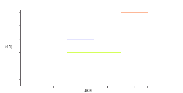
仿照着草图做了后发现,其实这样展示的是不全面的,因为空闲时间是个范围,这样只能展示某个时间,而不能很好的展示时间段之间的数据,于是经过我们再三思索,又花了第二个草图,大致如下:
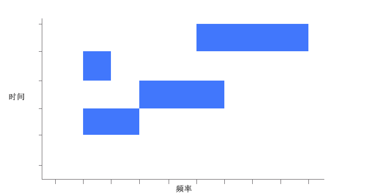
这个草图就可以很好的展示时间段与频率范围之间的关系了。
3、问题
但是当我利用现有的图表来绘制草图的时候,发现根本找不到哪个图表可以完整的来绘制我们想要的图表,经过我翻遍了ECharts图表所有实例后,找到了一个之前一直没接触过的"新东西" —— 自定义组件。
4、自定义组件
series-custom
自定义系列
自定义系列可以自定义系列中的图形元素渲染。从而能扩展出不同的图表。
同时,echarts 会统一管理图形的创建删除、动画、与其他组件(如 dataZoom、visualMap)的联动,使开发者不必纠结这些细节。
<template>
  <div class="chart-layout">
      <!-- 声明一个容器,用来绘制图表 -->
      <div :id="eId" class="chart" />
  </div>
</template>

<script>
import * as echarts from 'echarts'
export default {
  props: {
    data: {
      default: null
    },
    type: {
      default: 'noOccupy'
    },
    eId: {
      default: 'chart'
    }
  },
  data() {
    return {
      myChart: null,
      // 声明图表初始化内容
      echartData: {
        tooltip: {
          trigger: 'item',
          formatter: (params) => {
            // 数据颜色的标识
            const mark = params.marker
            let tooltipStr = mark + '空闲频率'
            if (Array.isArray(params.value) && (params.value.length > 0)) {
              tooltipStr = tooltipStr + `<br />开始频率:` + params.value[2]
              tooltipStr = tooltipStr + '<br />结束频率:' + params.value[0]
              tooltipStr = tooltipStr + '<br />开始时间:' + params.value[5]
              tooltipStr = tooltipStr + '<br />结束时间:' + params.value[4]
            }
            return tooltipStr
          }
        },
        grid: {
          top: '10%',
          left: '13%',
          right: '7%',
          bottom: '24%'
        },
        xAxis: {
          type: 'value',
          name: '频率(MHz)',
          nameLocation: 'center',
          nameGap: 30,
          // 清除横线
          splitLine: false,
          axisLine: {
            show: true,
            lineStyle: {
              color: 'white'
            }
          },
          axisTick: {
            show: true
          }
        },
        yAxis: {
          name: `时\n间`,
          type: 'category',
          nameLocation: 'center',
          nameTextStyle: {
            align: 'center'
          },
          nameGap: 90,
          nameRotate: 360,
          axisLabel: {
            formatter: val => val.slice(5, 16)
          },
          axisTick: {
            alignWithLabel: true
          },
          axisLine: {
            lineStyle: {
              color: 'white'
            }
          }
        },
        // 缩放组件,时间多的时候y轴内容会很小,所以y轴也加了一个
        dataZoom: [
          {
            type: 'slider',
            show: true,
            height: 10,
            bottom: 10,
            // 设置这个就可以和图表绑定,实现缩放,0为第一个图表,基本只有一个
            // 当前id绑定的图表,不是页面所有的。
            xAxisIndex: 0,
            borderColor: 'transparent',
            handleColor: '#aab6c6',
            realtime: true,
            start: 0,
            end: 100,
            textStyle: {
              color: '#fff'
            }
          },
          {
            type: 'inside',
            realtime: true
          },
          {
            type: 'slider',
            show: true,
            width: 10,
            height: 285,
            right: 20,
            bottom: 20,
            // 设置这个就可以和图表绑定,实现缩放,0为第一个图表,基本只有一个
            yAxisIndex: 0,
            borderColor: 'transparent',
            handleColor: '#aab6c6',
            realtime: true,
            start: 0,
            end: 100,
            textStyle: {
              color: '#fff'
            }
          }
        ],
        series: [
          {
            // 设置当前图表为自定义图表
            type: 'custom',
            // 开发者自定义渲染逻辑(renderItem 函数)
            renderItem: this.renderItem,
            // 给组件分配维度数据
            encode: {
              y: [5, 4],
              x: [2, 0],
              tooltip: [0, 1, 2, 3, 4, 5]
            }
          }
        ]
      }
    }
  },
  watch: {
    data(val) {
      this.setData(val)
    }
  },
  mounted() {
    this.initChart()
  },
  methods: {
    initChart() {
      this.myChart = echarts.init(document.getElementById(this.eId))
      this.myChart.setOption(this.echartData)
      if (this.data) {
        this.setData(this.data)
      }
    },
    setData(data) {
      const frees = []
      const occupys = []
      data.forEach(itm => {
        const { freeList, occupyList, ...times } = itm
        freeList.forEach(i => frees.push({ ...i, ...times }))
        occupyList.forEach(i => occupys.push({ ...i, ...times }))
      })
      const seriesData = frees
      this.myChart.setOption({
        series: [
          {
            data: seriesData.map(itm => Object.values(itm))
          }
        ]
      })
    },
    // renderItem 函数提供了两个参数:
	// params:包含了当前数据信息和坐标系的信息。
	// api:是一些开发者可调用的方法集合。
    renderItem(_, api) {
      // api.value(...),意思是取出 dataItem 中的数值。
      // 例如 api.value(0) 表示取出当前 dataItem 中第一个维度的数值。
      // 所以说自义定图表的单个data数据只能为一维数组。
      var endIndex = api.value(5)
      // api.coord(...),意思是进行坐标转换计算。
      // 例如 var start = api.coord([api.value(0), endIndex]) 表示 data 中的数值转换成坐标系上的点。
      // 左下角点的位置
      var start = api.coord([api.value(2), endIndex])
      // api.size(...) 函数,表示得到坐标系上一段数值范围对应的长度。
      // api.value(0) - api.value(2)计算图形宽度
      // 高度默认为一个间距
      var size = api.size([api.value(0) - api.value(2), endIndex])
      return {
        type: 'rect', // 自定义形状 - 矩形
        shape: {
            // 初始点的坐标
            x: start[0],
            y: start[1],
            // 形状宽度
            width: size[0],
            // 形状高度
            height: size[1]
        },
        // 图形样式
        style: api.style({ fill: 'blue' })
      }
    }
  }
}
</script>

<style>
.chart-layout {
    width: 800px;
    height: 350px;
    margin: 0 auto;
    background-color: darkgray;
}

.chart {
    width: 100%;
    height: 100%;
    padding: 0vw 1vw 1.5vw;
    box-sizing: border-box;
}
</style>
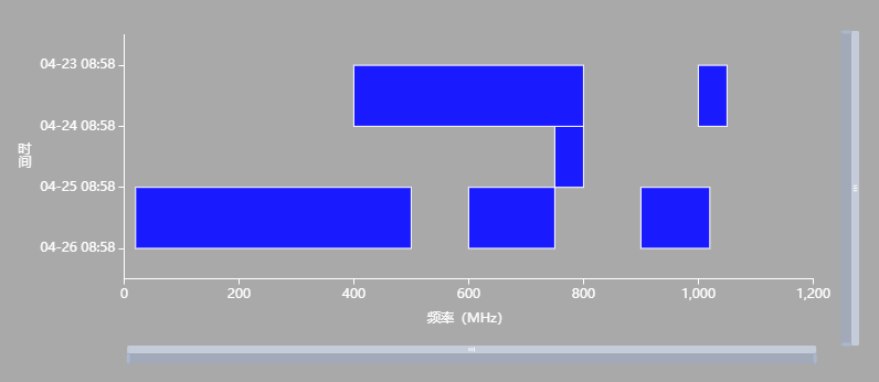
效果如下:
5、”聪明“的甲方
当做完这个功能以后,甲方又提要求了,不仅要显示时间段对应的频率范围,还要有一个占用度,用来表示当前频段范围占用了频率的百分比。
6、CSS百分比背景颜色?
我的想法是,可以设置css背景色百分比渲染dom,我翻过了css关于背景色的属性,好吧~,并没有找到相对应的属性,只好再次翻找自定义图表相关的属性了。
7、自定义组件组
然后我发现了这个,renderItem的type属性有个‘group’,可以返回一组图形。
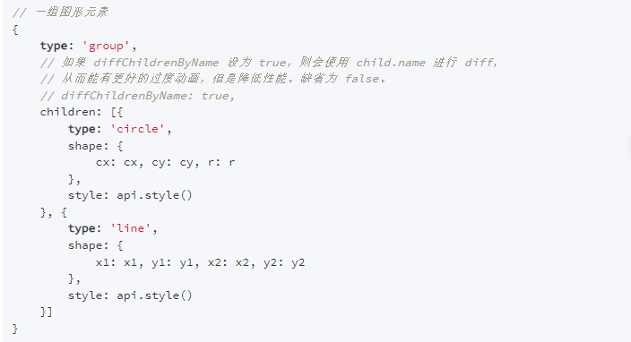
那么,这个属性可以帮我们实现想要的需求嘛?
是可以的,我们可以创建两个相同高度自定义图形,第一个图形宽度为全宽度只设置其边框,内容设为透明,而第二个图形设置其内容颜色,但宽度要和占用比相乘。两个图形合并,就可以达到我们想要的样子了。
<template>
  <div class="chart-layout">
      <div :id="eId" class="chart" />
  </div>
</template>

<script>
import * as echarts from 'echarts'
export default {
  props: {
    data: {
      default: null
    },
    type: {
      default: 'noOccupy'
    },
    eId: {
      default: 'chart'
    }
  },
  data() {
    return {
      myChart: null,
      echartData: {
        tooltip: {
          trigger: 'item',
          formatter: (params) => {
            const mark = params.marker
            let tooltipStr = mark + '信号占用度'
            if (Array.isArray(params.value) && (params.value.length > 0)) {
              tooltipStr = tooltipStr + `<br />开始频率:` + params.value[2]
              tooltipStr = tooltipStr + '<br />结束频率:' + params.value[0]
              tooltipStr = tooltipStr + '<br />开始时间:' + params.value[5]
              tooltipStr = tooltipStr + '<br />结束时间:' + params.value[4]
              if (this.type !== 'noOccupy') {
                tooltipStr = tooltipStr + '<br />占用度:' + params.value[1] * 100 + '%'
              }
            }
            return tooltipStr
          }
        },
        grid: {
          top: '10%',
          left: '13%',
          right: '7%',
          bottom: '24%'
        },
        xAxis: {
          type: 'value',
          name: '频率(MHz)',
          nameLocation: 'center',
          nameGap: 30,
          // 清除横线
          splitLine: false,
          axisLine: {
            show: true,
            lineStyle: {
              color: 'white'
            }
          },
          axisTick: {
            show: true
          }
        },
        yAxis: {
          name: `时\n间`,
          type: 'category',
          nameLocation: 'center',
          nameTextStyle: {
            align: 'center'
          },
          nameGap: 90,
          nameRotate: 360,
          axisLabel: {
            formatter: val => val.slice(5, 16)
          },
          axisTick: {
            alignWithLabel: true
          },
          axisLine: {
            lineStyle: {
              color: 'white'
            }
          }
        },
        dataZoom: [
          {
            type: 'slider',
            show: true,
            height: 10,
            bottom: 10,
            xAxisIndex: 0,
            borderColor: 'transparent',
            handleColor: '#aab6c6',
            realtime: true,
            start: 0,
            end: 100,
            textStyle: {
              color: '#fff'
            }
          },
          {
            type: 'inside',
            realtime: true
          },
          {
            type: 'slider',
            show: true,
            width: 10,
            height: 285,
            right: 20,
            bottom: 20,
            yAxisIndex: 0,
            borderColor: 'transparent',
            handleColor: '#aab6c6',
            realtime: true,
            start: 0,
            end: 100,
            textStyle: {
              color: '#fff'
            }
          }
        ],
        series: [
          {
            type: 'custom',
            renderItem: this.renderItem,
            encode: {
              y: [5, 4],
              x: [2, 0],
              tooltip: [0, 1, 2, 3, 4, 5]
            }
          }
        ]
      }
    }
  },
  watch: {
    data(val) {
      this.setData(val)
    }
  },
  mounted() {
    this.initChart()
  },
  methods: {
    initChart() {
      this.myChart = echarts.init(document.getElementById(this.eId))
      this.myChart.setOption(this.echartData)
      if (this.data) {
        this.setData(this.data)
      }
    },
    setData(data) {
      const frees = []
      const occupys = []
      data.forEach(itm => {
        const { freeList, occupyList, ...times } = itm
        freeList.forEach(i => frees.push({ ...i, ...times }))
        occupyList.forEach(i => occupys.push({ ...i, ...times }))
      })
      const seriesData = occupys
      this.myChart.setOption({
        series: [
          {
            data: seriesData.map(itm => Object.values(itm))
          }
        ]
      })
    },
    renderItem(_, api) {
      var endIndex = api.value(5)
      var start = api.coord([api.value(2), endIndex])
      var size = api.size([api.value(0) - api.value(2), endIndex])
      var occupy = api.value(1)
      return {
        type: 'group',
        children: [
          { type: 'rect',
            shape: {
              x: start[0],
              y: start[1],
              width: size[0] * occupy,
              height: size[1]
            },
            style: api.style({ fill: 'blue' })
          },
          { type: 'rect',
            shape: {
              x: start[0],
              y: start[1],
              width: size[0],
              height: size[1]
            },
            style: api.style({
              fill: 'rgba(255, 255, 255, 0.1)',
              lineWidth: 1,
              stroke: 'witer'
            })
          }]
      }
    }
  }
}
</script>

<style>
.chart-layout {
    width: 800px;
    height: 350px;
    margin: 0 auto;
    background-color: darkgray;
}

.chart {
    width: 100%;
    height: 100%;
    padding: 0vw 1vw 1.5vw;
    box-sizing: border-box;
}
</style>
效果如下:
